
CMYK vs Pantone for Plastic Bag Printing: Why Colour Shifts Happen and How to Avoid Them
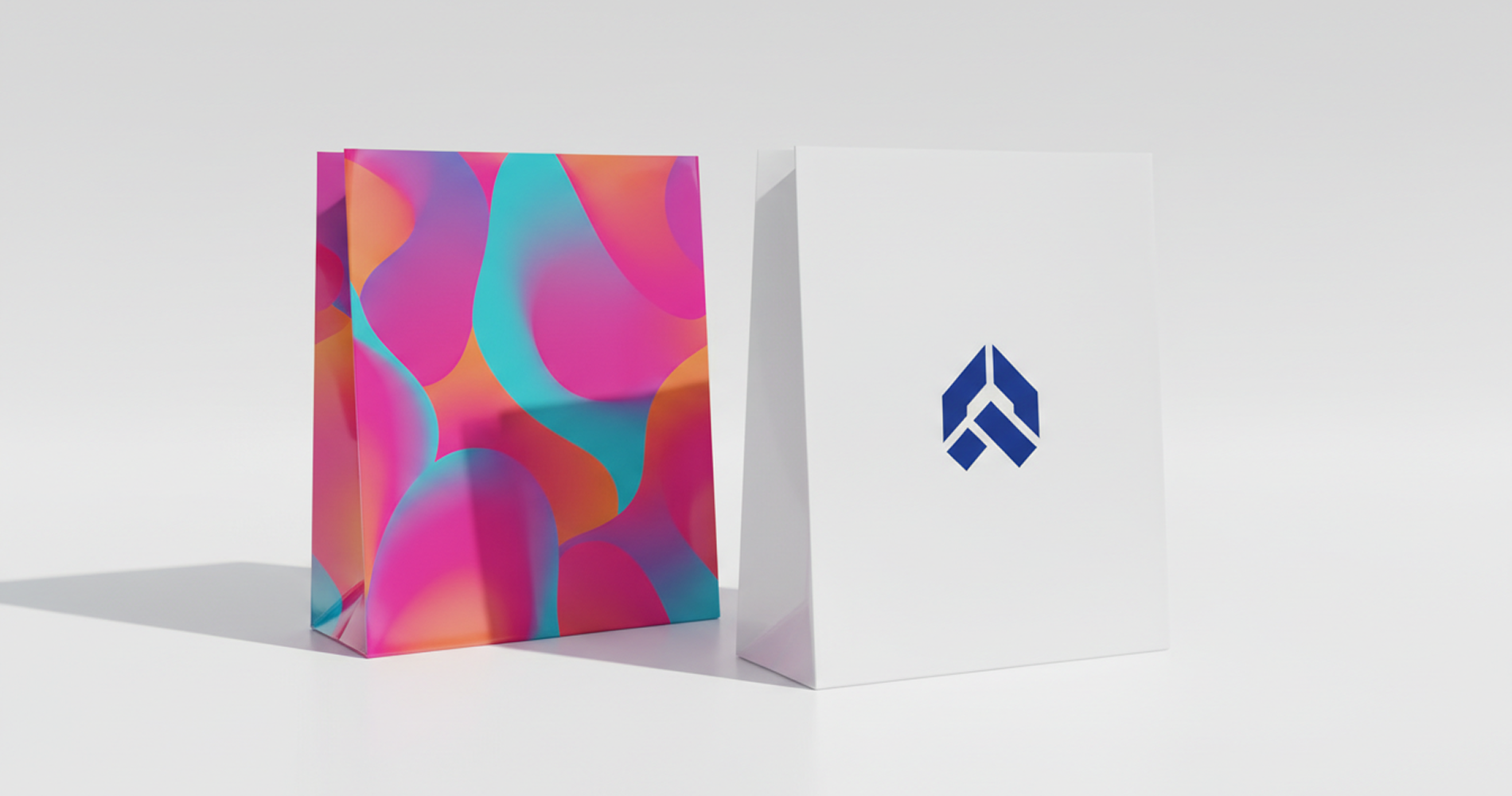
A retail brand approves a logo in a deep teal colour. On screen, it looks bold and consistent. The first batch of printed plastic carry bags arrives, and the colour looks slightly different. It is still teal, but a bit greener and less saturated than expected.
This situation is very common in plastic bag printing. In most cases, the artwork file is not the problem. The difference comes from how colour is reproduced in printing systems and how plastic film behaves compared to paper.
To understand this properly, we need to look at two key systems used in packaging printing: CMYK and Pantone.
CMYK vs Pantone for Packaging Printing
What is CMYK printing?
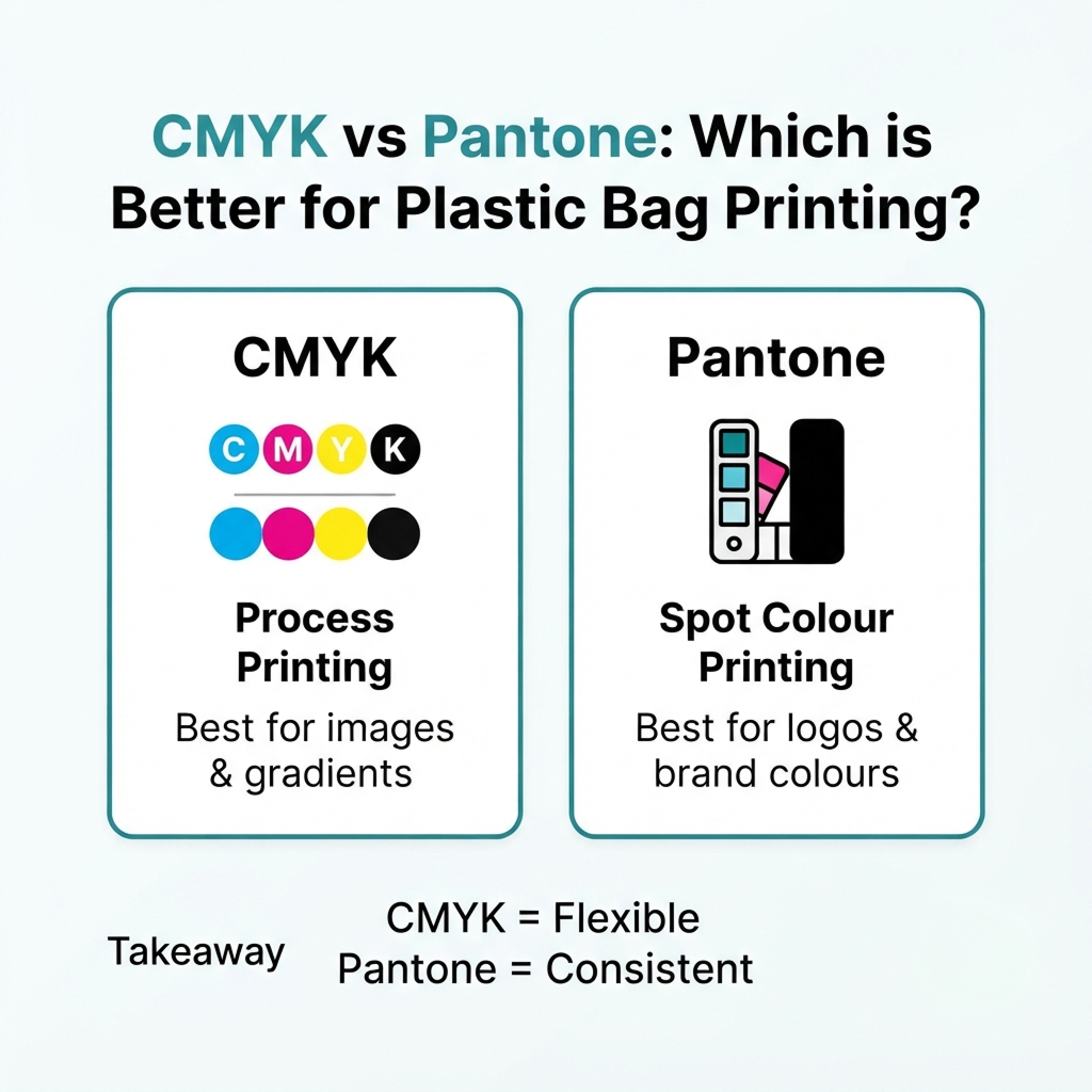
CMYK stands for Cyan, Magenta, Yellow and Black. It is a process printing method where colours are created by layering tiny dots of ink.
This method is commonly used for:
- Full colour artwork
- Images and gradients
- Designs with multiple colours
In CMYK printing, colours are not pre-mixed. Instead, they are built during the printing process. This makes it flexible but also introduces small variations depending on machine settings, ink density and material type.
What is Pantone (PMS) printing?
Pantone, also known as PMS (Pantone Matching System), is a standard colour system where each colour has a specific code.
For example, a brand red may be defined as Pantone 186 C.
Unlike CMYK, Pantone uses pre-mixed ink. This means the colour is prepared before printing rather than created through dot layering.
Pantone printing is commonly used for:
- Brand logos
- Corporate identity colours
- Solid colour packaging design
The main advantage is consistency. The same Pantone code is expected to produce the same colour across different print runs when conditions are controlled properly.
CMYK vs Pantone comparison
| Feature | CMYK Printing | Pantone Printing |
|---|---|---|
| Colour creation | Ink is mixed during printing | Pre-mixed solid ink |
| Best use | Images, gradients, multi-colour designs | Logos and brand colours |
| Colour consistency | Moderate, may vary slightly | High consistency |
| Cost | More economical for complex designs | Cost-efficient for 1 to 2 colour designs |
| Colour range | Wide but limited for very bright tones | Strong for solid brand colours |
Why Colour Looks Different on Plastic Bags
Plastic bag printing is not the same as printing on paper or cardboard. The material plays a major role in how colour appears.
1. Plastic film does not absorb ink like paper
Paper is porous, so ink is absorbed into the fibres. This helps stabilise colour appearance.
Plastic films such as HDPE and LDPE are non-porous. Ink sits on the surface instead of being absorbed. This makes colour more sensitive to:
- Ink thickness
- Drying conditions
- Surface treatment quality
Because of this, even the same colour formula can look slightly different on plastic compared to paper.
2. Surface energy and corona treatment
Before printing, plastic film usually goes through a process called corona treatment.
This process increases the surface energy of the film so that ink can adhere properly. In simple terms, it improves how well ink “sticks” to the plastic surface.
If surface energy is too low or inconsistent, the ink may:
- Appear lighter
- Look uneven
- Show reduced colour density
This is one of the most important but often overlooked factors in plastic bag printing.
3. Film type affects colour appearance
Different plastic materials can change how colour looks:
- HDPE (high density) tends to look slightly more matte
- LDPE (low density) can appear slightly softer in colour
- Recycled film may have a slightly grey or tinted base
Even if the ink formula is the same, the base material affects the final visual result.
Why Colour Still Shifts Even with Pantone
Many people assume Pantone guarantees exact colour. In reality, Pantone improves consistency, but it does not eliminate all variation in plastic printing.
Key reasons include:
- Differences in film batch or supplier
- Variation in corona treatment level
- Printing machine calibration differences
- Ink density adjustments during production
- Lamination or additional film layers
For laminated packaging, colour is viewed through multiple layers. Adhesives and additional films can slightly change brightness or contrast.
This is why professional packaging suppliers always recommend a physical sample on actual material before full production.
CMYK vs Pantone: Which One Should You Use?
Use CMYK when:
- Your design contains images or gradients
- You have multiple colours in artwork
- Minor colour variation is acceptable
Use Pantone when:
- Brand colour accuracy is important
- You are printing logos or solid brand elements
- You want consistent reorders over time
In many plastic bag projects, both systems are used together. CMYK is used for background artwork, while Pantone is used for key brand colours.
Common Mistakes in Plastic Bag Colour Printing
1. Approving colour from screen only
Screens use RGB colour mode, which is brighter than printed ink. This often leads to unrealistic expectations.
2. Assuming Pantone guarantees identical results on all materials
The same Pantone code can still look different on paper, plastic, or laminated film.
3. Not confirming material before printing
Film type directly affects colour appearance. HDPE, LDPE and recycled film behave differently.
4. Ignoring production method differences
CMYK and Pantone are not interchangeable in cost or output. The wrong choice can affect both budget and consistency.
5. Skipping physical sample approval
A printed sample on actual packaging material is the most reliable way to confirm colour accuracy.
How to Get Accurate Colour for Plastic Bag Printing
To achieve consistent and accurate results, it is important to work with a packaging supplier who understands both material behaviour and printing methods. You can also learn more about working with a professional Printed Bag Manufacturer Malaysia for customised packaging solutions.
To reduce colour issues, follow these practical steps:
- Always request a physical sample before mass production
- Provide Pantone codes for all brand-critical colours
- Confirm film type and thickness before production starts
- Keep artwork in correct CMYK format for process printing
- Ensure supplier uses proper corona treatment control
- Maintain consistent material specification for reorders
Conclusion
CMYK and Pantone both play important roles in plastic bag printing, but they work differently. CMYK is flexible and suitable for complex artwork, while Pantone provides stronger control over brand colour consistency.
However, colour accuracy in plastic packaging is not controlled by ink alone. Material type, surface treatment and production conditions all affect the final result.
Understanding these factors helps reduce colour mismatch issues and ensures your packaging reflects your brand more consistently across every production batch.
Ensure Your Packaging Colour Is Printed Accurately
If colour consistency is important for your packaging, Enrich Package can help you choose the right printing method, material, and colour system for your plastic bags.
Contact us for a sample and quotation before production to ensure your packaging colour is accurate from the first run.
Frequently Asked Questions (FAQs)
Can CMYK match all Pantone colours?
No. CMYK cannot reproduce all Pantone colours accurately, especially bright neons, metallics, and highly saturated tones. These colours are outside CMYK’s colour range and should use Pantone spot colour for best accuracy.
Why does my reprinted plastic bag look slightly different from my previous batch?
Even with the same artwork and Pantone code, small colour differences can happen due to changes in film batch, ink adjustment, machine calibration, or production conditions. This is normal in flexible packaging, which is why suppliers should control Delta E tolerance and material consistency across runs.
Why does my logo look different on plastic bags than on paper packaging?
Because plastic film and paper behave differently. Paper absorbs ink, while plastic film does not. Plastic also requires surface treatment before printing, which can affect colour density and appearance.
What Delta E is acceptable for packaging printing?
A Delta E (ΔE) of 2–3 is generally considered a good commercial match. Above 5, colour differences become noticeable and may not be suitable for brand-critical elements like logos.
Is Pantone more expensive than CMYK for plastic bag printing?
Not always. Pantone can be cost-effective for 1–2 solid colours. CMYK is usually more economical for multi-colour designs, gradients, or images.
Do recycled plastic bags affect print colour?
Yes. Recycled (PCR) film can have slight variations in base colour and clarity, which may affect how printed colours appear. It is recommended to approve samples on the actual material.
Should I use CMYK or Pantone for plastic bag printing?
Use Pantone for brand colours, logos, and solid colour packaging. Use CMYK for designs with images, gradients, or multiple colours. Many packaging designs use both methods together for best balance of cost and colour accuracy.
What should I provide for accurate colour printing?
Provide Pantone codes for brand colours, CMYK artwork files, and full material details (film type and finish). Always request a printed sample before production.
Can you guarantee 100% exact colour for every production run?
No manufacturer can guarantee identical colour every time due to material and printing variables. However, colour consistency can be controlled within an acceptable Delta E range using Pantone specification, calibrated machines, and approved production samples.
Disclaimer:
We hope you found this article informative. Our content is intended for general informational purposes only and does not constitute advice or necessarily reflect the full range of services offered by Enrich Package (Malaysia) Sdn. Bhd.
Readers are advised to consult with a qualified industry professional and contact our experts for packaging recommendations specific to their individual business needs. While we strive for accuracy and completeness in our blog posts, we cannot guarantee they are error-free. Enrich Package (Malaysia) Sdn. Bhd. assumes no responsibility for any errors or omissions.